Recognition Over Recall
Product Design
As the UX designer for CSM Manager, the admin surface of Symplicity's career services platform, I redesigned the form builder that staff use across career fairs, events, and jobs - and built the internal testing app and practice that validated it.
Role
UX Designer (end-to-end owner)
Duration
March - June 2026
Tools
Figma
Claude Code
Cursor
Jira
The load-bearing tool
Symplicity CSM is the market-leading career services platform, used by more than 1,300 university career centers to run jobs, events, career fairs, and advising. I design CSM Manager, the administrative surface where career center staff do that work, and I have owned its design end to end for five years, from research through developer handoff.
Forms are the connective tissue of the product. Career fairs need registration forms, events need RSVPs, jobs need applications, and staff build all of them in a form builder that touches nearly every module. When a tool is that load-bearing, its friction taxes everything downstream.
A flow built on recall
The old builder had aged visually, but the deeper problem was the flow for adding a field. It offered a dropdown and a search box, which meant staff had to already know the name of the field they wanted. If you knew CSM’s field vocabulary by heart, it worked. If you did not, you were guessing at names in a search box.
Recognition over recall
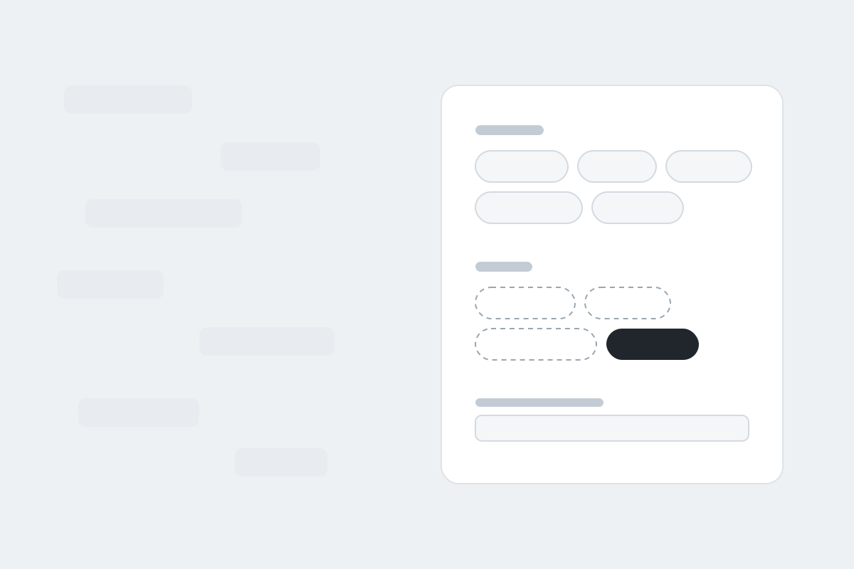
The redesign made one central bet: recognition beats recall. Instead of asking staff to remember field names, the new builder lays the fields out on screen, grouped into two categories: the standard fields that ship with the system and the custom fields staff have created themselves. You find a field by seeing it, not by naming it. The visual layer was rebuilt in line with the broader Manager refresh, but the interaction change is the part that matters.
Try both versions:
The decision I defended hardest was leaving something out. An engineer on the team wanted a search bar on the add-a-field view, a reasonable instinct, since search was what the old design had. But with every field visible and categorized, search solved a problem the layout had already eliminated, and it would have put visual weight back on a view we had just simplified. We shipped without it. The best argument against a feature is a design that makes it unnecessary.
Plain language over jargon
The same recall problem showed up in the builder’s most powerful feature. Fields can show or hide based on other fields’ answers, but the old UI spoke database: you opened a “Dependencies” accordion, clicked “Add Controller,” and typed a field name into an unlabeled box. Staff had to know the jargon, recall the field name, and save before they could see whether any of it worked.
The redesign phrases the same logic the way a person would say it: show this field when Sponsorship Available is Yes. Rules read as sentences, editing is recognition all the way down, and the form reacts the moment you save. Same engine underneath, different language on top.
Try it. Flip Sponsorship Available to Yes on the form:
Testing it like software
CSM Manager had little to no user testing practice when I started, so validating the redesign meant building the practice alongside the design. I built an internal testing app to run it: study goals, participant personas, session capture, and results in one structured place. Then I served the redesigned builder as a working prototype from my own machine and ran five 45-minute moderated sessions with internal staff. Many of them are former career center staff, which makes them unusually credible proxy users.
Testing against working software instead of a click-through is the same workflow I use everywhere: the prototype is the scratch paper.
What changed at handoff
Handoff used to mean a stack of meetings, with missing states surfacing after development had already started. Delivering full state coverage, atomic components in Figma plus AI-assisted prototypes built with Claude Code, replaced most of those meetings with artifacts developers could build from directly.
What I would do differently
Timing. The working prototype and the testing were the right moves, and both came later than they should have. Next time the prototype comes first, and it gets in front of actual customers, not only internal proxies, as early as possible. Proxy users are good. Real users are better.